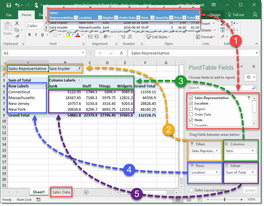
Excel Pivot Tables & Charts Training
In this Microsoft Excel Pivot Tables and Charts course you will learn how to analyze data using these important tools. You will learn how to turn a table of data into a manageable analysis, without ever having to alter the original table. You will also learn how to give your data more visual impact, using the many different charts available in Excel.
Training Goal
In the Microsoft Excel Pivot Table and Charts training, students will come from class with more confidence in using Pivot Tables and Charts, as well as have an understanding of how data in Excel can be displayed in a visual way. They will learn how to create Pivot Tables that can calculate, compare, and total data from a table. They will also feel confident in how to use all of the various formatting tools to make their Pivot Tables really pop. Students will also learn all of the different types of charts available in Excel, and when best to use each. Additional charting techniques will be covered, allowing the students make their charts really stand out from the default templates, including drop-lines and unique axis formatting, as well as using trending, and analysis tools.
PreRequisites
Students should enter the Excel Pivot Tables and Charts course with an understanding of Excel fundamentals, including formatting, navigation, and basic formulas.
Topics Covered
Pivot Tables training topics
- Creating, sorting, and filtering data
- Formatting styles
- Numbers and layouts
- Grouping data
- Value Comparisons
- Row and Column Comparisons
- Adding running totals and percentage totals
- Calculated fields and items
- Combining multiple data sources
- Creating Pivot Table charts with filters and design elements
- Conditional formatting
- Other classes covering Pivot Tables
Charts training topics
- Creating charts
- Understanding single versus multiple series charts
- Modifying chart design, layout, and format
- Creating charts from non-consecutive data
- Drop-lines
- Axis formatting
- Replacing chart series with pictures or shapes
- Analysis tools
- Up-Down bars
- Trending tools
- Using secondary axis
- Highlighting relationship differences with charts
- Combining two charts into one
- Doughnut Charts
- Sub-Pie Charts
- Paired Bar Charts